Responsive Device Mockup for Mobile & Tablet Layouts
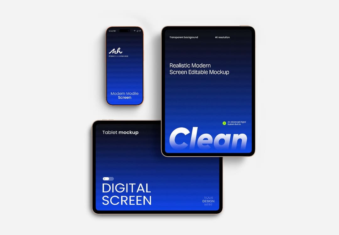
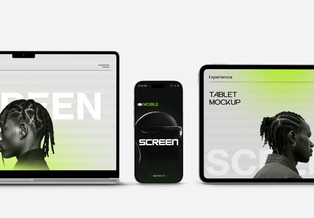
This phone and tablet mockup helps you display the same design on various screen sizes. The clean side-by-side layout makes it easy to compare both devices. This way, responsive UI sections, ecommerce pages, and app screens look more organized during the presentation.
Instead of adding dramatic effects, this mockup keeps the composition simple and balanced. It's great for client previews, portfolio case studies, or product showcase pages.
You can directly edit the mockup online if you want a faster workflow. The mockup works smoothly inside the MockupHive Figma plugin.
What You Get in This Mockup
- Phone and tablet mockup scene
- Responsive device presentation layout
- Clean multi-screen composition
- Editable PSD smart layers
- Online editing support
- Compatible with Figma workflows
Best Uses for This Layout
This setup is perfect for displaying:
- Responsive website previews
- SaaS dashboards
- App onboarding screens
- E-commerce mobile layouts
- UI case studies
- Modern digital product presentations
It displays both tablet and phone views side by side.
The wider tablet screen also helps larger interface sections stand out without making the layout feel crowded.
Phone and Tablet Mockup Responsive Device Display
Mockup Details:
File Type:
File Size:
Editable Online:
Editable in PSD:
Dimension:
Category:
PSD
23.76 MB
Yes
Yes
2982px X 2073px
device mockups
Tags
Share On Social :
Flexible Plans
for Every Design Need
Gain unlimited access to our entire collection of mockups through one simple, hassle-free subscription.
Free
Perfect for getting started — 1 free high-res download per day.
Pro
Perfect for freelancers and small teams — 30 mockups/day.
Unlimited
Best value for agencies and power users — unlimited downloads.
Lifetime
Best for agencies and pros — unlimited lifetime downloads.
